
Exploring the New Power BI Card: A Comprehensive Overview
The recent addition of the new card visual in Power BI, introduced in June 2023, has caused quite a stir within the Power BI community. The level of enthusiasm and the wealth of content generated around this native visual are unprecedented. The array of options it offers is truly remarkable, and it represents just the initial step of a broader deployment strategy ambition set to bring a profound transformation and enhancement of Power BI’s native visuals.
What I find particularly appealing about this transformative initiative is its dual impact, enhancing both visual aesthetics and analytical capabilities simultaneously. At the helm of this ambitious program is Miguel Myers, who assembled a dream team to execute the best vision and propel Power BI to new heights.
The initial release of the new card visual represents just the beginning. Even in its preview version 1, it has already had a considerable impact. It’s worth noting that the card visual is one of the most used visuals in Power Bi reports and has remained unchanged since the tool was released.
One of its standout features for now is its ability to effortlessly create aesthetically pleasing metrics, incorporating elements such as logos, accent bars, titles, and values, all within a single visual element on your canvas. From a performance and maintenance perspective, this is indeed a remarkable achievement.

One of the noteworthy tips and contributions I came across in the community revolves around the use of SVGs, DAX, and their combined potential to unlock creativity in displaying images inside these new cards. These images can be transformed into KPIs that encompass both metrics and relevant context, including graphs, trendlines, year-on-year comparisons, planned figures, forecasts, and more.
The central focus of this blog post is to address the following questions:
“Can the new card visual influence report construction from a storytelling perspective, and how much can it be pushed in this regard?
To tackle these questions effectively, we must divide our attention into two distinct areas: data strategy and technical feasibility.
Emphasis on Data Strategy
"If one does not know to which port one is sailing, no wind is favorable." - Lucius Annaeus Seneca"
Everything starts with a purpose and a plan. We must initially determine what we wish to create and why we are embarking on this journey.
Let’s start with the basics: What exactly is a KPI?
At first glance, this may seem like a straightforward question with a universally understood answer. A KPI is often perceived as a prominent number displayed at the top of a report screen. You’ve probably encountered many such reports in the community – they appear simple, clear, and effective, don’t they?
However, this perception is flawed.
This is a common pitfall that developers often stumble into when crafting reports. These metrics or “Big Angry Numbers” (BANs) are rendered meaningless without context. Imagine presenting your report to an executive. You have these BANs at the top, alongside filters for departments, solutions, geographies, and a dynamic line chart or bar chart that adapts to the user’s selections.
What do you think the executive will learn when selecting “Finance” for department, “Slovenia” for country, and “Product 1”?
The executive is presented with KPIs: “435k Total Sales” and “444 Unit Sales.”
I believe that:
1) The executive will not have these numbers committed to memory, meaning they won’t be able to form an immediate opinion about the results. Is this good or bad? What action should be taken based on this information?
2) The executive will attempt to establish benchmarks. Is this performance better than last year’s? How does it fare against the budget or forecast? Should we prioritize year-on-year comparisons over budget comparisons? What is the hierarchy of importance?
Presenting mere numbers fails to provide analytical value; in fact, it introduces noise. Even before delving into the intriguing insights integrated into your report, you risk losing your audience’s attention and interest.
Hence, the first order of business is to never label these BANs or metrics as “KPIs.” KPI stands for Key Performance Indicators, and they must be actionable and crystal clear. Their role is to spark questions, capture users’ attention, and create the initial tension that propels your audience on a storytelling journey. From a storytelling perspective, they serve the crucial purpose of raising insights.
3) The relevance of KPIs in Storytelling with Data
Not all Key Performance Indicators (KPIs) hold the same level of interest for your audience or align with your story’s objectives.
Consider the following scenario: your report is being shared with both a CFO and a Marketing manager. Do you think they have an equal level of interest in the same KPIs? The answer is a clear no. Their interests can vary significantly.
From a storytelling perspective, meticulous attention must be given to these nuances. Before diving into Power BI to create your reports, it’s imperative to gain a comprehensive understanding of your audience, their expectations, the added value you aim to deliver, and how your report connects to the broader data strategy and company goals.
And there’s one more issue. This issue touches on a widespread misconception surrounding the concept of storytelling with data, especially when using interactive tools like Power BI. There is a prevailing belief that dynamic, fully interactive reports can only incorporate elements of storytelling, but not entirely. This notion stems from the fear that filters and interactivity could compromise control over the narrative.
I respectfully disagree with this notion and aim to demonstrate how the new card visual can provide the control needed to dispel this theory. Interactive reports in Power BI not only can include storytelling but can elevate it to new heights.
Now, let’s summarize the key takeaways so far:
1. A KPI is more than just a single number;
a number alone can be termed as a metric or, if used incorrectly, as Big Angry Number (BAN).

2. A KPI derives its meaning from context, and this context should be tailored based
on the type of KPI and the intended audience.

3. Not all KPIs are equally relevant to your story or a specific audience.

4. To truly leverage storytelling in Power BI, you must have full control over the user's journey.
Given these considerations, we have a clear direction and a set of objectives to integrate into what we want to test:

I aspire to create KPIs “by the book” using the new card visual. I venture to guess that the chosen KPIs presented as numbers hold particular importance for the audience. Sometimes, the true essence of a KPI is a ratio between two metrics. The core of a KPI must revolve around what end users value most.
To elevate these numbers into KPIs, I aim to infuse them with additional context. Commonly associated context elements include comparisons with Forecast, Budget, and Last Year, displaying their respective values, calculating deltas in values and percentages.
To enhance context further, I seek to integrate dynamic comments tailored to each KPI and scenario. These comments play a vital role in storytelling, as it’s not sufficient to merely display data. You must narrate it effectively.
In addition, I need to incorporate information related to the last data refresh. This detail contributes to building user confidence and fostering adoption.
Moreover, I’ve strived to include:
- Definitions of the KPI.
- Calculation formulas for the KPI.
- Data sources.
- Interpretations of the KPI.
- Contact information for additional questions.
I’ve also explored the incorporation of distinct tooltips for each KPI.
You might wonder why I’ve chosen to display only one color (red) for negative results but not green for positive ones. This decision stems from the cautious use of color. In most cases, the audience is more interested in negative results. If the red color isn’t used, it implies that the results are “good.” This approach aligns with the “back to black” concept. The objective is to transform all results into positive ones, always striving for improvement.
However, you might ask yourself the following: What if the results significantly surpass the plan? This indeed presents an intriguing insight, as excessively good results may indicate unanticipated factors or external events. In the realm of data, context is key, and the relevance of such insights varies depending on the scenario. The storytelling journey I aimed to construct in my theoretical example didn’t encompass this specific scenario.
When selecting the KPI from the filter, you’ll notice that my primary benchmark, “vs Forecast,” is highlighted.
Does this mean that when choosing “Budget,” the benchmark in the card changes to “vs Budget,” altering the values, deltas, and percentage deltas? Absolutely! The order dynamically adapts to reflect the user’s choice. And that’s not all. The second and third benchmark also changes.

In essence, everything reconfigures to showcase the scenario that matters most to the user. Yet, there’s an additional layer of customization. It even controls the accent bar and, ultimately, the KPI displayed.
You might be taken aback, so let me clarify what I mean with “control the KPI displayed”:
Is it possible to analyze four KPIs but only show the top two or worst two, based on the user’s selection? This customization adds a new dimension to storytelling. Imagine the user navigating a plethora of KPIs, concentrating on the most crucial ones, be they positive or negative, all based on their selection.
The power of analytics in this setup is truly remarkable. Rather than preparing to tell a single story, you are building multiple stories, each tailored to what matters most to the end user.
Powerful, isn’t it?
And there’s more…
I’ve explored the possibility of displaying different types of KPIs and adapting them for each audience. This means that the Finance Manager sees the top two or worst two KPIs relevant to finance metrics, while the Marketing Manager views those pertinent to marketing metrics. The result? With one report, you achieve an exceptionally high level of customization for each audience, all without creating a cumbersome system. After all, the report still requires maintenance. The beauty of the new card visual lies in the fact that it generates only one element on your screen.
As a summary, here’s a quick look at what I aim to create and make dynamic:

Are you intrigued? Excellent! Let’s roll up our sleeves and delve into the intricacies.
Emphasis on Technical feasibility
After sketching and deciding what we want to achieve the first step is thinking about the means necessary to make it happen.
The model
My goal is to build KPIs that will display specific logos for each metric, display dynamically the definition, the formula, and the interpretation. I also need to create categories to display only KPIs that are relevant to the audience (marketing and finance).
a) For this purpose, I created a KPI table with the following columns:
-
- Definition
- Department
- Formula
- Interpretation
- KPI
- KPI logo

In my example, this table includes a total of 8 KPIs. The rationale behind this is to ensure that I can successfully display the bottom 2 and top 2 metrics based on the user’s selection, which is my ultimate objective.
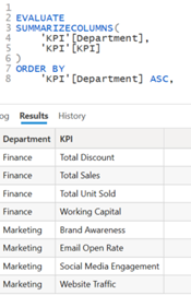
To build the image URL for the logos I did the following:
- Downloaded the desired logos from www.flaticon.com
- Uploaded the icon to base64 Image encoder: https://www.base64-image.de
- Copy the generated image URL
- Defined the column as Image URL inside Power Bi

b) I am also interested in showing below the KPIs a comment that gives more context to what the user is seeing. I therefore created a table called “Comments.” This table displays for each KPI and each scenario (point of view POV) a specific comment.
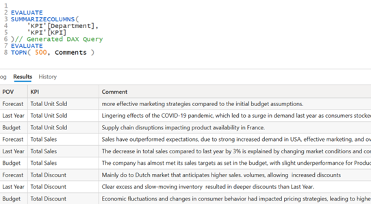
This table is connected to the previous created KPI table
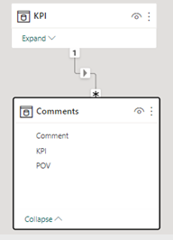
c) We complete our model with:
- a “Key Measure” table to order our future DAX measures.
- a “Dates” marked as Date Table
- a “Story” table with two rows: Good / Bad
- a “Performance KPI” table with 3 rows for the Point of view: “Last Year / Forecast / Budget”
- a “Fact Table” like financials table.
DAX
With our model set in place, we are set up for success!
The following step is to focus on the measures we need to build. There are quite a few. So let’s start in order.
We start with the creation of the general measures:
- We calculate the total Measures for our 8 KPIs and we group the measures inside a “Total” folder.
- We then create 8 measures for Budget, Forecast, Last Year, % B, % F and % Last Year and group them in other folders.
The naming convention is important. We aim to achieve consistency and facilitate maintainability.
- We end with the creation of 8 measures where we compute the Target for each KPI.

Now we start to concentrate on KPI1 and KP2. I created a specific folder for each.
KPI 1 Folder
Our goal is to calculate the first KPI value based on various conditions and selections the user will do inside the Power Bi report. (Like choice of department, Performance, and choice of POV: Budget, Forecast Last Year).

We need to use the same pattern for the measures KPI_1 B ; KPI_1 F; KPI_1 LY
Once we find the max or min value, we need to identify the name of the respective KPI.
The measure KPI_1 Title with identify based on the KPI_1 value the name of the measure.

We now want to identify the logo for the computed KPI_1 Title.
.

Now we need to identify the Card KPI 1 & 2 (card 2)
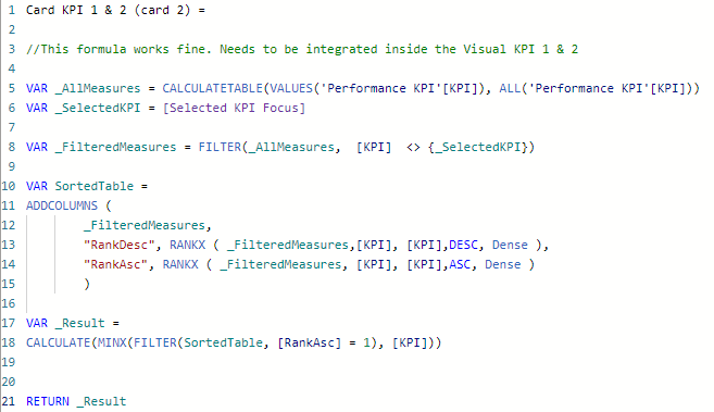
And Card KPI 1 & 2 (card 3)

These measures will be leveraged by KPI1_Card 2

And KPI1_Card 3

We compute Target KPI 1

We now have everything we need to build our Visual KPI1 SVG visual


A very similar logic will be used for Visual KPI2.
If you find SVG particularly difficult or do not know where to start from, I encourage you to download the templates from Kerry Kolosko or Štěpán Rešl blog, try them out, modify them. Also, I recommend you follow videos and posts from Andrzej Leszkiewicz, Daniel Marsh-Patrick.
In my case (it was the first time I built a custom SVG), I found particularly useful to use ChatGPT as a copilot and try to find my way through trial and error.
Limitations encountered.
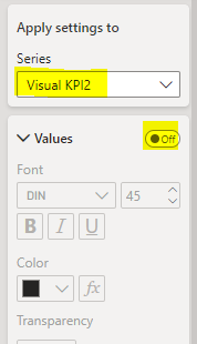
While building these KPIs, I observed what seems to be a bug. I cannot enable values to specific KPIs without enabling the same option to all the others in the series. I think this bug is already identified by Microsoft and will soon be fixed.
Putting all together:
To spice things up even further, I decided to create an additional SVG measure that exclusively activates when a specific KPI (Website Traffic) is visible. That is because not all KPIs are identical. In certain cases, comparing values to alternative scenarios like Forecast, Plan or Last Year holds less significance than monitoring the trend for example. Consequently, it can be considered a best practice to employ distinct types of indicators for specific use cases.
The ability to implement this within the same native visual exemplifies the vast range of possibilities at our disposal with this native visual.

To build the experience I wanted to embark the audience in a specific user journey. I decided to add on top of the new card visual a button “See Details”.
This button is transparent when the performance is positive, and it becomes visible when the values are negative. The button will direct the user to a more detailed page specific to the KPI displayed.

Another aspect I wanted to incorporate is independent and different tooltips for each KPI
In the images below you will see how the tooltip is dynamic and different for each KPI


I added the dynamic comments below each KPI for even more context.
I also added an info button with dynamic tooltip for the KPI displayed

Last but not least I added a legend using Header Options -> Help tooltip

And that’s pretty much it!
Final thoughts
“Can the new card visual influence report construction from a storytelling perspective,
and how much can it be pushed in this regard?”
Based on the extensive testing and results achieved, I think that the new card visual in Power Bi does have the potential to significantly enhance storytelling and influence report construction. However, expecting it to single handedly fulfill all storytelling needs would be unrealistic.
Instead, we should view this visual as an integral part of a broader toolkit, strategically using it to enhance our narratives.
In my perspective, there are specific patterns and strategies that can serve as accelerators for effective storytelling in Power Bi. To harness its full potential, we must focus more on the problem to solve, align with the business requirements, consider our target audience, and map the user journey.
Power Bi offers an array of features and visuals that, when used strategically, can elevate our storytelling game.
From the standpoint of KPIs, I consider myself satisfied by the result. The combo new card visual, SVG, DAX & Buttons is extremely powerful. The ability to seamlessly integrate these elements has expanded the storytelling capabilities, enabling us to craft more engaging and informative reports.
As we continue to explore the recent features and the ones announced for the near future, there is no doubt that innovative storytelling techniques will continue to evolve. The possibilities are limitless. It’s an exciting journey ahead!
Alex Badiu

Hi, this is a comment.
To get started with moderating, editing, and deleting comments, please visit the Comments screen in the dashboard.
Commenter avatars come from Gravatar.
Wonderful post however I was wondering if you could write a litte more on this subject?
I’d be very thankful if you could elaborate a little bit
more. Kudos! https://miradora.top
Really great techniques which show the great level of love you dedicate to creatt the almost perfect KPI-experience for your audiene! 👏
This is a topic that is close to my heart…
Thank you! Where are your contact details though?
I absolutely love your blog.. Pleasant colors & theme.
Did you build this website yourself? Please reply back as I’m wanting to create my own site and want to learn where you got this
from or exactly what the theme is called. Appreciate it!
Hi there! This article could not be written any better! Looking through this article reminds me of my previous roommate! He always kept talking about this. I am going to send this information to him. Fairly certain he’ll have a great read. Many thanks for sharing!